はじめに
JSのチャートライブラリは色々ありますが、よく聞くものでChart.jsがあります。
今回はこのライブラリを使って、グラフ描画する時に一番使いそうな、折れ線グラフ、棒グラフ、円グラフを描画してみたいと思います。
準備
npmでインストールする事可能ですが、
| 1 | npm install chart.js |
今回はお試しという事でCDNを利用します。
折れ線グラフと棒グラフ
コード全体
| 1 2 3 4 5 6 7 8 9 10 11 12 13 14 15 16 17 18 19 20 21 22 23 24 25 26 27 28 29 30 31 32 33 34 35 36 37 38 39 40 41 42 43 44 45 46 47 48 49 50 51 52 53 54 55 56 57 58 59 60 61 62 63 64 65 66 67 68 69 70 71 72 73 74 75 76 77 78 79 80 81 82 83 84 85 86 87 88 89 90 91 92 93 94 95 96 97 98 99 100 101 102 103 104 105 106 107 108 | <head> <meta charset="utf-8"> <title>グラフ</title> <script src="https://code.jquery.com/jquery-3.4.1.min.js"></script> <script src="https://cdn.jsdelivr.net/npm/chart.js"></script> <script> // jQueryでDOM生成してからscriptを実行させる $(() => { const labels = ['1学年前期', '1学年後期', '2学年前期', '2学年後期', '3学年前期', '3学年後期']; const data = { labels: labels, // x軸のラベル // グラフ表示するデータ datasets: [ { label: '数学', // 各グラフのラベル backgroundColor: 'rgb(135,206,250)', // 各グラフの背景色 borderColor: 'rgb(135,206,250)', // 各グラフの淵色 data: [0, 10, 35, 42, 50, 60, 75], // 各グラフの値 }, { label: '英語', backgroundColor: 'rgb(255, 99, 132)', borderColor: 'rgb(255, 99, 132)', data: [85, 90, 77, 10, 33, 100, 90], }, { label: '国語', backgroundColor: 'rgb(144,238,144)', borderColor: 'rgb(144,238,144)', data: [10, 30, 50, 70, 55, 95, 80], } ] }; const options = { title: { display: true, text: '成績表' }, animation: { duration: 1000 // アニメーション速度 }, // ツールチップ plugins: { tooltip: { backgroundColor: '#933', } }, scales: { // Y軸 y: { // 最小値・最大値 min: 0, max: 100, // タイトル title: { display: true, text: 'テスト点数', color: '#FF4500', rotate: 'vertical', font: { size: 20 } }, ticks: { // 目盛刻み stepSize: 10 } }, // x軸 x: { title: { display: true, text: '学期', color: 'rgb(255,69,0)', font: { size: 20 } } } } } // グラフ生成 const canvas = document.getElementById("lineChart"); const lineChart = new Chart(canvas, { type: 'line', // グラフの種類 data: data, // グラフのデータ options: options // グラフのオプション }); const canvas2 = document.getElementById("barChart"); const barChart = new Chart(canvas2, { type: 'bar', data: data, options: options }) }); </script> </head> <body> <h1>折れ線グラフ</h1> <canvas id="lineChart" style="width: 50%;height: 50%"></canvas> <div style="margin-top: 100px"></div> <h1>棒グラフ</h1> <canvas id="barChart"></canvas> </body> |
html
グラフ描画用に
canvasタグ
を用意します。
type
で、グラフの種類を変更出来ます。
| 1 2 3 4 5 6 | <h1>折れ線グラフ</h1> <canvas id="lineChart" style="width: 50%;height: 50%"></canvas> <div style="margin-top: 100px"></div> <h1>棒グラフ</h1> <canvas id="barChart"></canvas> |
JS
上記のcanvasのDOMに対して、グラフ描画しています。引数で必要な値を渡します。
| 1 2 3 4 5 6 7 8 9 10 11 12 13 14 | // グラフ生成 const canvas = document.getElementById("lineChart"); const lineChart = new Chart(canvas, { type: 'line', // グラフの種類 data: data, // グラフのデータ options: options // グラフのオプション }); const canvas2 = document.getElementById("barChart"); const barChart = new Chart(canvas2, { type: 'bar', data: data, options: options }) |
dataの記述です。ここでグラフの値やグラフのUIを設定しています。
| 1 2 3 4 5 6 7 8 9 10 11 12 13 14 15 16 17 18 19 20 21 22 23 24 | const data = { labels: labels, // x軸のラベル // グラフ表示するデータ datasets: [ { label: '数学', // 各グラフのラベル backgroundColor: 'rgb(135,206,250)', // 各グラフの背景色 borderColor: 'rgb(135,206,250)', // 各グラフの淵色 data: [0, 10, 35, 42, 50, 60, 75], // 各グラフの値 }, { label: '英語', backgroundColor: 'rgb(255, 99, 132)', borderColor: 'rgb(255, 99, 132)', data: [85, 90, 77, 10, 33, 100, 90], }, { label: '国語', backgroundColor: 'rgb(144,238,144)', borderColor: 'rgb(144,238,144)', data: [10, 30, 50, 70, 55, 95, 80], } ] }; |
optionsの記述です。Y軸やタイトルなど、メインとなるグラフ以外部分の設定をしています。
| 1 2 3 4 5 6 7 8 9 10 11 12 13 14 15 16 17 18 19 20 21 22 23 24 25 26 27 28 29 30 31 32 33 34 35 36 37 38 39 40 41 42 43 44 45 46 47 48 | const options = { title: { display: true, text: '成績表' }, animation: { duration: 1000 // アニメーション速度 }, // ツールチップ plugins: { tooltip: { backgroundColor: '#933', } }, scales: { // Y軸 y: { // 最小値・最大値 min: 0, max: 100, // タイトル title: { display: true, text: 'テスト点数', color: '#FF4500', rotate: 'vertical', font: { size: 20 } }, ticks: { // 目盛刻み stepSize: 10 } }, // x軸 x: { title: { display: true, text: '学期', color: 'rgb(255,69,0)', font: { size: 20 } } } } }; |
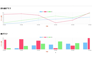
描画するとこんな感じになります。
円グラフ
データ少し変更して、円グラフを描画してみます。
html
グラフ描画用に
canvasタグ
を用意します。
| 1 2 3 4 | <h1>円グラフ</h1> <div style="width: 800px;height: 800px;margin: auto"> <canvas id="pieChart"></canvas> </div> |
JS
type: 'pie'
を設定しています。
| 1 2 3 4 5 6 | const canvas3 = document.getElementById("pieChart"); const pieChart = new Chart(canvas3, { type: 'pie', data: data, options: options }); |
dataの記述です。今回は分かりやすく、データ数値の合計が100になるように設定しておきます。
| 1 2 3 4 5 6 7 8 9 10 11 12 13 14 15 16 17 18 19 20 21 22 23 24 25 26 27 | const data = { labels: labels, // グラフ表示するデータ datasets: [ { backgroundColor: [ 'rgb(135,206,250)', 'rgb(147,112,219)', 'rgb(144,238,144)', 'rgb(240,128,128)', 'rgb(255,215,0)', 'rgb(255,99,71)', 'rgb(220,20,60)' ], // 背景色 borderColor: [ 'rgb(135,206,250)', 'rgb(147,112,219)', 'rgb(144,238,144)', 'rgb(240,128,128)', 'rgb(255,215,0)', 'rgb(255,99,71)', 'rgb(220,20,60)' ], // 各グラフの淵色 data: [50, 30, 10, 5, 2, 2, 1], // 値 }, ] }; |
optionsの記述です。
| 1 2 3 4 5 6 7 | const options = { title: { display: true, text: 'ワールドカップ成績 日本代表予想', fontsize: 20 } }; |
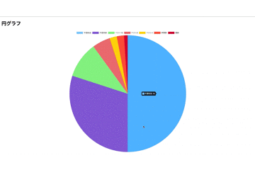
描画してみると、こんな感じになります。
さいごに
Chart.jsを利用すると、非常に簡単にグラフ描画する事が出来ます。
グラフにしたいデータをサーバーサイドで準備すれば、そのまま実装出来そうです。
おすすめ書籍